

STYLE SHEET
Description: My target descriptors were old-world, rustic, accessible high-end, earthy. The logo was pre-existing, but there had been no other branding.

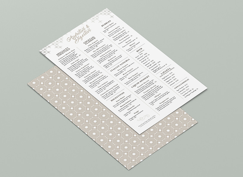
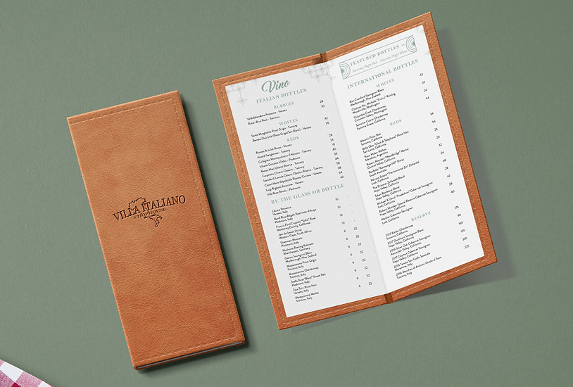
MENUS
Client: Westgate Resorts Food & Beverage and Marketing Departments
Challenge: To create a look and feel for a new restaurant cohesive with and based entirely off of existing logo and interior design plans.
Format: Dinner menu restricted to horizontal tabloid based on client request, wine list single-sided to be placed in menu holder book.
Description: Below is my original menu concept. The motifs are elements from the interior design plans, including the diamond shape from the dining area floor tiles and the medallion from the entrance area floor mosaic. The original space renderings also included hanging Edison bulb lighting, which inspired the use of the diamond motif as "stars" along the top of the menu. We originally pushed for separate menus for dinner, dessert, beer & cocktails, and the wine list, allowing for more efficient printing updates, a more tailored dining experience, and the opportunity to create a color and pattern program distinguishing each menu.

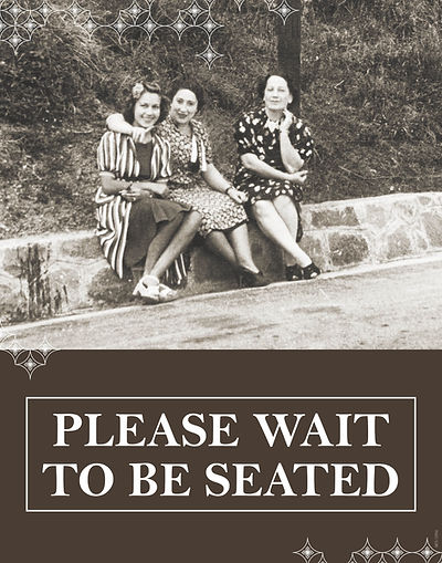
SIGNS
Client: Westgate Resorts Marketing Department
Challenge: To create a look and feel for a new restaurant cohesive with and based entirely off of existing logo and interior design plans.
Format: Dinner menu restricted to horizontal tabloid based on client request, wine list single-sided to be placed in menu holder book.
Description: Interior design's renderings included unknown portraits on the walls and display cases for antique vases, so I wanted to run with this idea of creating a false history for this establishment through the use of antique photos.

ON-SITE ADVERTISING
Client: Westgate Resorts Food & Beverage and Marketing Departments
Challenge: To create a look and feel for a new restaurant cohesive with and based entirely off of existing logo and interior design plans.
Format: Multiple sizes - elevator posters, letter-size counter cards, pocket-sized inserts (for use at resort location).
Description: One of the biggest challenges for creating promotional material was a lack of assets, since the space was not yet completed at this stage. Using only the 3D renderings we had, I created pieces that showcase the space and have a clear message.

PRINT ADVERTISING CONCEPT
Client: Westgate Resorts Food & Beverage and Marketing Departments
Challenge: To create an attention-grabbing ad for an external audience consistent with established collateral.
Format: Half-page print ad in I Love Orlando Magazine.
Description: My first instinct was to depart from the rendering angle and continue with the antique photo idea because it struck me as something that would stand out in a tourism magazine featuring ads from many other restaurants. Copy for first ad was provided by the client. In the second option, I made the decision to eliminate most of the unnecessary messaging.
*Note: By this point, the entire project had started to go in a different direction to more closely match Westgate's other Italian restaurant in Las Vegas, which is why the logo is different in the ads from the earlier materials above.

